How To Automate Design Handoffs and Set Up a Design System with Figmagic
Avoid the potential horrors and pitfalls of designer-developer handoffs with modern tooling—Generate code, tokens, graphics and documentation from Figma
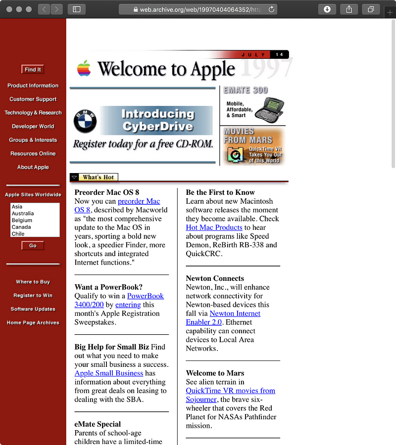
Dale Sande, Design Technologist at Alaska Airlines, makes a brilliant introduction to his talk on design systems and web components, when he shows Apple and Disney’s web sites from 1996, and says:
Teams were put together for these very small things to build. The technology wasn’t big, so you didn’t need a big team. So what I find ironic is—we all know it, you can look at this and go “oh God that’s 1996, web sites don’t look like that anymore”. But I’d argue that in a lot of places teams treat teams like you’re building web sites in 1996. Right? You have really small teams. You have disjointed design people. You may have a design person on your team. But are they actually really treated like a team person? You are trying to cover all your bases with a small team to deliver this insanely complex—which I don’t call web pages anymore… They’re fricking applications.
Yes, it’s certainly true that expectations on what experiences on the web—or just using web technologies overall—are substantially higher (and different!) today than they were in 1996. It’s almost never as simple as a few images and a column or two of text. Lots of it is about things like asynchronous data fetching and complex state management, across all kinds of screens and devices. And as brands and businesses want to reuse code and design across more and more services, getting them to co-exist is getting harder.
But. I started coding HTML and CSS back in 1997, myself. The basics of how things work on the web have actually been remarkably stable over those 23 years. Many of the very first things I learned at the ripe age of 11 stay true even today. Professionally, I see teams having many of the same struggles in 2020 that I suppose were fought in Apple’s web team when I first began putting hands to keyboard in ’97.
One of the most powerful evolutions happening since then is the transition to component-based structuring in front-end development. While React may not have been the first player on that ball, it’s definitely made components mainstream (I dabbled with PHP to do that a long time ago, though that was 😫) . So instead of writing every instance—every place where a thing/component should show up—as its own copy-pasted snippet of code, inevitably falling out of line somewhere sometime, we can wrap that in a reusable package. And since we should ensure stability and the same interface and properties for the component, its use should stay problem-free and consistent. While this also does take a bit of work, most of which is boilerplating, that’s a fairly common reality nowadays. I am willing to say that we have now reached a significant point in web technology when this is actually a more-or-less standardized way of doing things, regardless of one’s technical framework. It even works fine with JavaScript template literals, tiny frameworks, and the big hunkajunks like Angular.
For the rest of the article, I’ll focus on how the designer-developer handoff and interactions can be equally improved, now that you have the technical context so I can write something about what is possible to do, easy to do, and can be standardized to some extent. With that, I also spend some time on why the soft side of organization and workflow is just as important, as was noted in the quote at the start.
So, there’s a list of things we want a new process and/or tool to do for us:
✅ Have a shared source-of-truth for understanding the design and what its execution should be
✅ Enforce a structured way of creating UI components that can be transformed into realistic code
✅ Shared documentation
✅ Automate manual work, to aid in updating any work that’s been done
As you could probably have guessed, I will tell you how Figmagic—a tool I’ve built on over the last two years to support informed handoffs between designers and developers—“just happens” to help with all of those things!
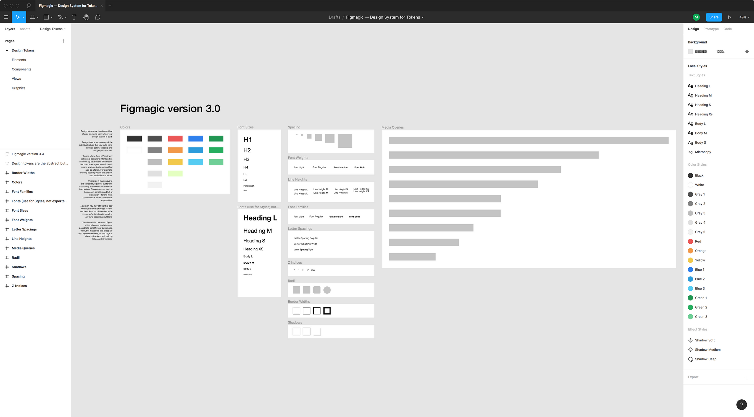
There’s a design system template in the Figma community:
This is version 3.0 of the example design system to generate tokens with Figmagic…www.figma.com
And the source code is at:
Generate design tokens, export graphics, and extract design token-driven React components from your Figma documents…github.com
It’s a regular npm install figmagic for you devs, by the way.
Let’s take a look at how Figmagic helps you succeed.
0. Prepare and set correct expectations
It may feel like everyone is doing design systems nowadays, while your own team is, for reasons unknown or at least highly unclear, stuck with Photoshop exports. You open a web browser. You Google a bit. “Does it really have to be like this?”, you ask no one in particular.

Dribbble is full of mock systems, Airbnb keeps updating theirs and Design Systems Repo is bursting at the seams.
An organized and frequently updated collection of Design System examples, resources, tools, articles and videos.designsystemsrepo.com
All that cool stuff. They must be really smart… And loaded with cash… And your own days may feel more like:

But how does “everyone else” (hint: everyone is not doing this) go from “the way it’s always been done” to “OMG that’s the slickest thing ever and it was a perfect symphony 🎼 of structured design 🔨 and basically zero code 🦄 and I didn’t do any overtime 🕐 at all”?
The dream or ambition is of course to have a smooth, absolutely seamless transition or handoff from one thing into another. But alas, alchemy does not work: It’s a fool’s errand to convert one type of thing into something dramatically different, such as a static bitmap image into responsive, interactive multiformat code.

An age-old snake-oil remedy has been for designers to relay the code that a tool like Dreamweaver or Zeplin outputs to developers, who will rightfully throw it in the trash where it belongs. Many times pixel values (or other absolute units) are the only values a designer is able to provide. These are usually meaningless for the developer, though, and are dead-on-arrival in the age of Responsive Design which we are well and deeply into. To make matters worse, unit types and conversions can be dependent on context and use.You may want to specify what units you require, but that’s not something you can do, in most cases. At the end of the day, if your “automated” tools don’t provide good results that are at least mostly right, then you might as well build stuff from scratch. Back to square one 😞.
And again, what happens, is that the actually helpful attempt from one end of the relation meets brimstone and doom, resulting in further aggravation. Everyone is in tears. “Why don’t designers get that this is garbage omfg why even bother?”, more than one developer has probably grumbled in their dark recesses over a decaf latte. Soy milk. No sugar, please. Aye, dark are the days when there is an ocean between design and code.
Figmagic cannot help you in the soft relations. You will have to make a coordinated effort to work together across teams and disciplines with your tooling. While I’ve been an avid Figma fan for many years, it’s not the case that all companies and their designers use Figma. You’ll have to begin somewhere: By getting a Figma account, learning the ropes, and then using that as the source-of-truth.
That one thing above is actually the secret behind using Figma at scale: That it can be the single source-of-truth as long as you and your team(s) don’t fall back to old habits of sending files and versioned copies around. Trust me: You will find out why this is a big thing. If you’ve made the transition in the last decade to online documents instead of offline Excels and .docx files, you already know what I mean. I’ve been with big companies and small companies using Figma and similar tools. They all failed in their design efforts when they diverged too much from their sources-of-truth and lost eyes on process.
No tool is any good without decent processes around its use. Figma, like continuous deployment in code, changes the game in so many ways. But equally: You will never solve process problems by merely switching the tool. Therefore, as you get started, make the extra effort to read up on some of the basics and how people and teams actually work with it. Some of the very best — and practical! — reading of how to do developer-designer work with Figma is by Figma’s own Designer Advocate, Thomas Lowry.
When I switched to Figma, my experience working with developers totally changed. Instead of handing off designs to them…www.figma.com
Do also take a look at the subsection called “Tips for better designer + developer collaboration”.
I’ll stay here while you read and proceed to having those discussions. It shouldn’t be a breakup, just that everyone commits to working in new ways! And don’t forget: the same way in a unified fashion! 😃
1. Use a shared language: Design Tokens
So you made it through the really hard parts, I see (deciding to work in new ways and that, no, none of those curse words or insults were really meant personally).
The first order of business should now be to produce a set of tokens; tokens whose exact values don’t even matter! However, those values should be able to represent the pertinent information, and allow transforming into the right contextual type (px, em, rem, pt, unitless…). Since their naming is our contract, the name should be immutable, while values will change as often as they need. Your “blue1” is going to go from deep sky blue to a baby blue, and Mark will of course mess with you and leave it a slime green to see if you are awake. But the developer shouldn’t care. That’s designer business.

These seemingly magical values are called Design Tokens. This concept is used by a lot of companies, including some of the biggest companies on earth. Design tokens are the abstract but shared elements from which your design system is built. They are the smallest units you can use to create the rest of your design ecosystem.
What are design tokens? What role do they play in a design system? How can you use them ?uxdesign.cc
Tokens offer a form of “contract” between a designer’s intent and its fulfillment by developers. This means that both sides agree to avoid by all means anything that’s not codified also as a token. For example, avoiding spacing values that are not also available as a token.
You’d be forgiven if you thought these feel similar in many ways to old-school style guides—but tokens should only ever communicate strict, hard values. Style guides can tend to be context-sensitive and full of explanation — tokens must communicate without context or explanation. Cut down on verbiage and cut down on head-scratching and coffee-machine meetings.
What now, then? The missing piece tends to be tooling and glue between:
- A place to store tokens
- A place to work with tokens
- A place to see tokens and what values they represent
- A way of outputting those values
- A way of placing those values in the context of code
Finally, answers! The first three you should do in Figma. Easy as that! Once again—flogging that dead horse one more time—Figma will be your source-of-truth. Look at the above image to see how this can work.
For outputting tokens and placing them in the context of code, use Figmagic. When a developer pulls data from your Figma-based design system document (oh the glories of API-driven online SaaS like Figma ❤️), brand-new tokens will be generated in their source code folder.
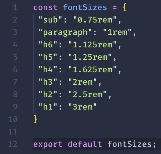
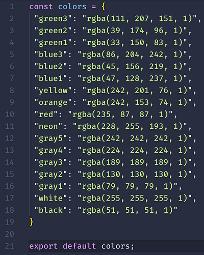
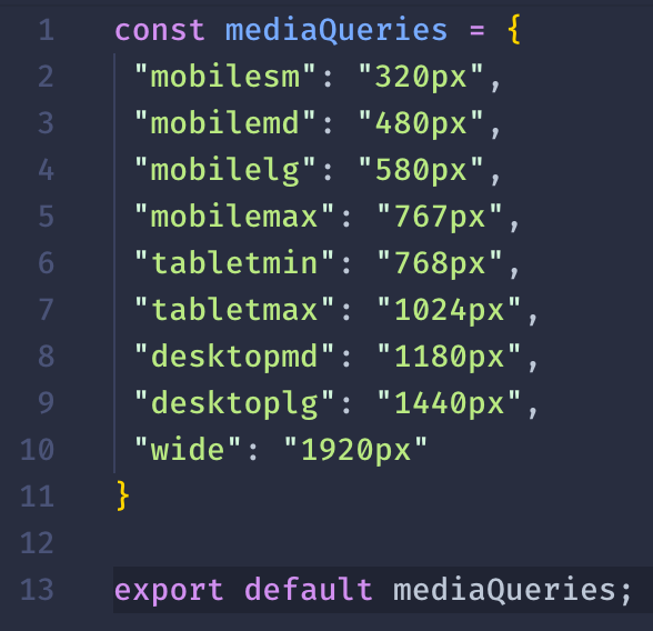
Design tokens in Figma will almost always be uni-dimensional, meaning that you create an item, for example a rectangle and give it a color. Don’t give it more than one property! Next, place the rectangle in a “Colors”-named frame in the page called “Design Tokens”, and voíla: You can extract your color value in Figma into code! Repeat this for the various tokens and types, and you’ll have a big set of tokens shortly. The generation step will infer that you are interested in getting colors from any items in the frame with that name and so forth. Should be fairly easy to follow along this far.
Figmagic currently picks up:
- Colors
- Font Sizes
- Spacing
- Font Weights
- Line Heights
- Font Families
- Letter Spacings
- Z Indices
- Radii
- Border Widths
- Shadows (currently only supports a single Drop Shadow)
- Media Queries
This list maps to almost all of the things you can do with Styled System, which many of you love. You should also bind or connect tokens to Figma styles whenever and wherever possible to simplify your own design work. You will gain the most leverage when there is tight sync between them — everyone benefits!
What this ultimately means for everyone is that turnover time is drastically reduced, and quality across the board should be easier to maintain. Also, developers get far fewer of those annoyed looks across the office landscape and a lesser frequency of the nagging sensation that “whoops, musta screwed up another one of those color changes”.
Tokens are fantastic in many ways. My three favorite things about them are:
- They are super easy to read and understand, and are adaptable for consumption by many types of systems or applications. That’s very important as you start doing cross-platform apps and things along that vein.
- Tokens ensures that values are not magic numbers or ”just picked at random”. This makes communication effortless. Creating actual code for components, even complex ones, also becomes a lot less of a bore, since what you are doing is just pointing stuff like padding, sizing, Z indices and whathaveyou to tokens. When the designer updates the token values, and doing a fresh pull for new tokens, things just magically update. Bigger updates, like changing from a token X to token Y will still require a code change, but the effort is practically negligible.
- They absolutely nail the need to enforce standards. Designers, in my experience, usually want to say something about how structured and rigorous they are. Tokens will be a good test of how much they really are up to snuff.
However: You may still want to add written guidance for usage. It’s just that the tokens should be able to be consumed without understanding anything specific about them. Read more about this in the “Documentation” chapter coming up below.
Designers should of course also use the tokens as their own constraints and affordances. Add tokens as you go but avoid to make one-offs and ”special cases” (no such thing as unique snowflakes in the kingdom of tokens)! That’s not very systematic, creating yet again the burden of manual labor, which I’m sure we agreed on was a Bad Thing™.
Examples of design systems that use tokens
I wrote that people actually use tokens, and since you don’t fully trust just any random Medium writer, here’s a few public examples to prove my point.
Design tokens for Polaris, Shopify's design system - Shopify/polaris-tokensgithub.com
Design tokens are the visual design atoms of the design system — specifically, they are named entities that store…www.lightningdesignsystem.comAlaskaAirlines/OrionDesignTokens
Orion Design Tokens are abstract UI atomic values that make up the greater Orion Design System (ODS). The goal of this…github.com
Themes are used to modify existing components to fit a specific visual style. By using Carbon's tokens, developers can…www.carbondesignsystem.com
2. Enforce a structured way of creating components
Figmagic promotes a structured way of assembling design systems. Design tokens were the first road stop, followed by graphics.
Graphics can also be exported in multiple formats with Figmagic. Instead of doing manual handovers, just tell your developer(s) that there have been updates to the graphics and let them pull the latest versions from your Figma document.
Thus far, the need for handover for tokens and graphics should be virtually zero.
Next up, then, is providing a systematic way of creating elements that—when put together—form more complex UI components. This is a huge progression from just pulling simple tokens. Following the primary principle of atomic design, Figmagic asks you to build from the bottom up. Instead of over-eagerly trying to do hard-coded code generation from huge and complex components, Figmagic aims at competently—or at least “mostly-right”—handle automation for things that should not be too context-dependent or manual input-heavy. Moreover, it encourages behavior and naming consistent with standard CSS and HTML: no magic trickery!
A foundational text for component architecture is written (you knew it, didn’t you?) by Figma’s Thomas Lowry.
Last year I published the article “Building flexible components in Figma”. Since writing that article, Figma has added…blog.figma.com
In the below article, a concept called “Dynamic Elements” is put forward as a way to store states or versions within the same Figma Component:
Using Dynamic Elements solves the problem of changing between states of an Atom between screens in the prototyping phase. By making use of hidden layers, we can use the Dynamic Element of the toggles (that contains all the Atom toggles) and hide whichever layer we want to be seen in each screen.
Over the course of the previous year I’ve been trying to follow a more solid design system using Figma. The power of…medium.com
It’s a pattern I’ve seen used in many places, and is something that was already done during the dark ages of Sketch at least back in 2016 as far as I can remember. That pattern is actually very, very similar to how Figmagic expects your components to look.
Introducing “Elements”
PSA: The “Elements” concept is only just that—a concept. There is no such thing in Figma. Elements are actually components, but the ideas get too intermixed if we don’t find new words.
Recommendation: Read this while clicking around in the design system template for it to make even more sense. It should be fairly obvious when you actually interact with it! 😅
Elements are named so because they are primarily meant to help scaffold anything that maps to standard HTML elements like input, button, h1, and form. With scaffolding we mean that these elements can be generated as code in a shape that as fitting for continued development. We use this concept to create highly-regulated components that a tool—like Figmagic—can understand and generate code from.
Let’s be clear and frank: There is no way to generate “perfect” components since there is so much variation in taste, standards, tooling and many other parameters. What we want to do is to ease the burden of templating the many files that exist for a typical front-end component these days. From out-of-the-box, Figmagic can generate:
- React file
- Styled Components file
- CSS file (exported object, “CSS-in-JS style”)
- Storybook file
- Markdown description
You are saving a fair number of minutes per component just through the actual generation and boilerplating of files. Oh, and you can use your own templates and provide your own patterns for what to generate or skip, so any of your custom-extended files don’t get overwritten on the next pull. The strategy has been to do something that’s reasonable and extensible rather than pursue any kind of perfect production-ready stuff. I’ll leave it to you to add fairy dust. 🌟
Having rigor and standards around elements is how we could get there. Without regulated components (“elements”) this would be very hard.
Right now, you can do simple, flat elements or nested ones, where you want “stateful” behavior like being invalid or disabled.
Flat elements are Figma components that include (usually) a text layer and a layout layer. For now, the layout layer needs to have the same name as the component.

Nested elements contain nested groups with text and layout layers. Nesting only works for the first layer; no deeper layers will generate code. The way this works should be more or less the same as the above external links, with one variant per nested group, like here: Normal, Warning, and Error. A group will generate a CSS class that’s easy for the developer to use. Figmagic will hoist all shared code to the top and only put unique lines of CSS in the respective classes.
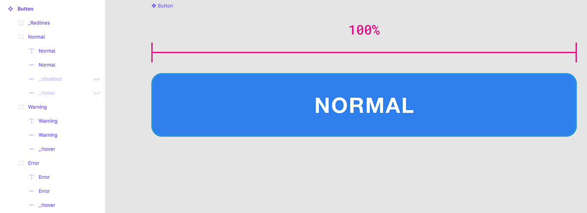
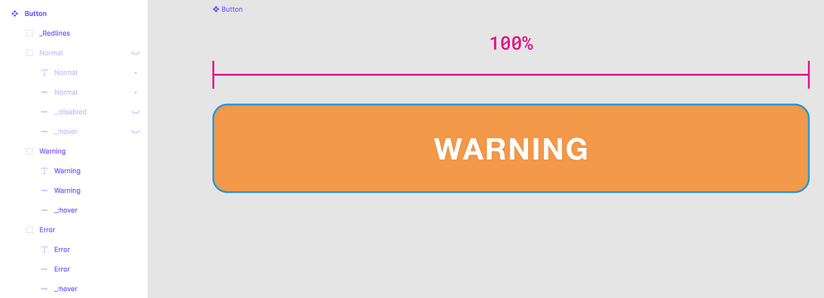
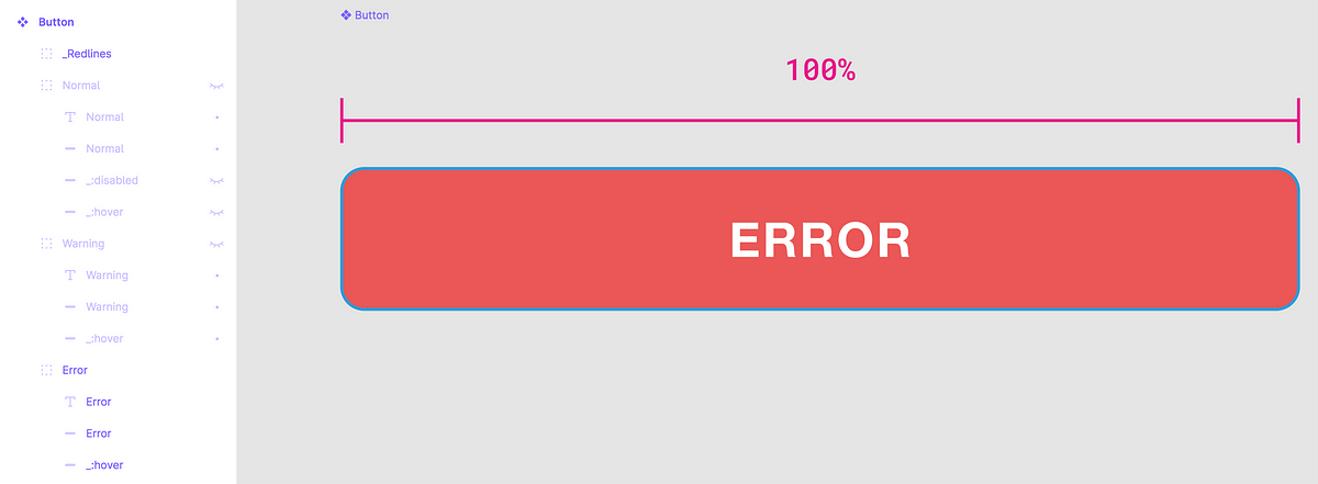
Note how you can prefix with : to set/communicate a pseudo-selector
(like :hover) and _ which will be ignored during code
generation. Anything prefixed like a pseudo-element will be generated as that,
instead of like a class.
How does it know what HTML element to generate? Easy, but manual… You need to
specify it in the description field like element=button or
element=input .

As the scaffolding is experimental you should pay attention to the expected Figma structure for it to work. Expect that many things are still unsupported (such as images) for now. Developers among you should read the documentation in detail to understand the current limitations around this.
By the way: You should definitely still continue to layout your elements/components as they should look in their final state, but understand that the output is likely not 100% complete right after generation. Even with a bit of manual putting-on-hands, you should be dealing with design that’s stricter, less conflicting, and easier to update.
In my design system example, there’s two more pages that deserve a few words.
Components
The “Components” page outlines the bigger, regular components (or compositions, maybe, in the case of this big form) that your developers will build. Try to only use any of the Elements you have created previously to dramatically ease the developer workload and to stay strictly consistent with your design system.
Note that nothing on this “Components” page is output automatically as code — this page is purely for communicating what should be built.
Views
The “Views” page is where you would collect the complete view of whatever you are building: this could be pages (like a web site) or complete/partial views in an application.
Notice how this example uses the component from “Components” which in turn is nothing than a collation of componentized “elements”. Normally, a page or view will be a number of components.
Since this is a basic example, only the mobile version has been modified. By cleverly using auto-layout and constraints you may be able to skip the type of hackjob I am showing in the mobile view! :)
The Views page is not generated into code, either. It should be a very small thing for a develop to assemble a page or view if they’ve built the elements, then the components, before-hand.
3. Shared documentation
Documentation in design is something that I have a very mixed bag of experiences with. This probably has to do with the fact that it’s something that lacks line-of-work standardization (whereas developers have conventions around README’s and code comments etc.), and because tooling tends to miss built-in mental models and support for docs.
How to solve this issue while providing a foundation for designers to annotate and document their work? For clarity: We are looking primarily for lightweight solutions that can aid in our automation efforts.
A good start is to look at some outstanding material around design docs. I was surprised finding such excellent reading for this seemingly boring area, actually! I’ll be the first to admit I have no own answers to provide about best practices, but please look at the following which I hope can start a good conversation:
Overview of the ways to make documents clearer, better structured, and more appealingmedium.muz.li
How to write a project README that boosts your design team’s cohesion and productivity.medium.com
The above should give you directions for how to document design and its processes overall.
What I can help you with is how to do more of the “inline”-type documentation. That is, the text and context that makes sense to provide inside of Figma.
By simply annotating our master components we can leverage a very semantic, readable, lightweight method of providing context. These annotations become a super-useful way in which the designer can specify the used tokens so the developer can effortlessly implement them in no-time.
Using annotations to convey behaviors, error cases, and design changesuxdesign.cc
Meaningful information to convey is for example what tokens you want the developer to use when building the component in code. Use a plugin like Figma Redlines to point out hard-to-see tokens or features like paddings inside of an element. Instead of—like you would in traditional style guides— write out hex colors or pixels, just reference the token value, such as “spacing-xs”. Redlines is a brilliant easy-to-use tool that you should absolutely put in your toolchain.
Need to annotate your designs with more detailed measurements, nodes, or intricate redlines? This library includes a…www.figma.com
Quickly molding a UI library with Storybook
Maybe you’ve heard of Storybook. If not, it’s a (free) tool for some of the biggest front-end frameworks where you can organize and interact with your UI components. It’s stunning, and also very simple to use. Coding components in isolation is not always the best fit, but many times it’s both faster, more convenient and a lot less messy to do so. Storybook is used by lots of companies and brands, thus it’s well-supported and likely to stay around for some time. It’s also got tons of plugins so it can be extended practically in whatever way you want.
Another killer feature is that you can easily deploy your entire UI library—so that you too can have your own slick-looking library at design.yourcompany.com or whatever strikes your fancy without breaking a sweat. No more multi-million dollar deals with an ad agency to do so 💵 💵 💵.
Beyond that, Storybook also provides a dead-simple, approachable way for non-techies to see what actually exists in code, what data is driving it, and what the state of your front-end is RIGHT NOW.
My two cents: Use Storybook. Figmagic outputs both the main Storybook file, as well as markdown files from your Figma component description field, so you can stick your Figma documentation in the hands of everyone. Super good. Do it!
Ending remarks
By now, you’ll have seen how all the boxes in the introductory section are now definitely checked.
I can’t answer for how long any of your soft processes would take to reshape, but I can guarantee that setting up a design system like above and deploying it on a service like Netlify or Zeit will take you just 15 minutes or so, if you choose to go with my template and use the linked example source code.
This repository is a demo of Figmagic. In this project you're going to see how a project running Webpack, React and…github.com
And, I mean, it doesn’t output anything super fancy, just a nested form:
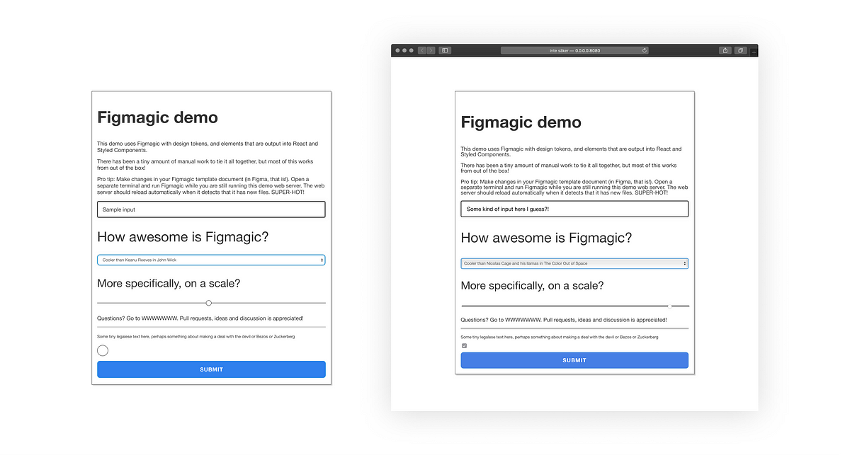
But that semi-complex form took me just 10 minutes to make, and it’s 95% straight
out of a Figma document. I literally only had to make a few minor adjustments to the
Figmagic-generated source code and then to add the application logic to the
components. And whenever the designer (well, in this case, me) changes his mind (as
I do a lot), all I’ll need to do is run figmagic in my command line. So
very, very easy.

Design systems and all these gizmos can sound really hard, complex and unattainable for Average Joe or Smallville Mom&Pop Shop. The above shows that it’s not, and in these times of Corona virus and economic decline, we will all need to work together and look for faster, smarter, better tooling in our respective jobs.
Figmagic was created from my own frustration around often poor communication, requirements drifting and tedious busy-work coding front-end projects. My job resolving those frustrations is not done until we can completely remove such mess and inefficiency.
I hope that you’ll give it a try, and let me know what you think of it! If you’re a developer, do feel free to make pull requests in GitHub. Let’s make “handoffs” history!