
Design tokens and why design systems need them?
One magic, simple concept and a one-stop-shop to contain our design equals one hell of a powerhouse.
What you will learn in this article
- Learn what design tokens are
- Learn how you can work with a “structured design” approach
This is an excerpt from a course I am making with Newline, called “The newline Guide to React Component Design Systems with Figmagic”.
You might also be interested in my article “How To Automate Design Handoffs and Set Up a Design System with Figmagic”.
Structured design and controlled evolution
okens offer a form of “contract” between a designer’s intent and its fulfillment by developers. This means that both sides agree to treat the individual parts of a complete design through the tokens that represent those values. As a format, they are super easy to read, understand, and adapt for consumption by many types of systems or applications. That’s very important as you start doing cross-platform apps and anything similarly complex.
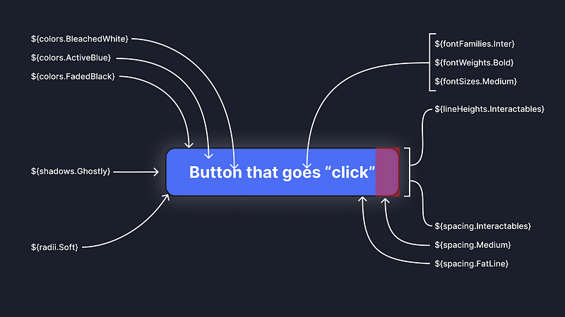
Tokens ensure that values are not magic numbers or ”just picked at random”. This makes communication precise and effortless. Creating actual code for components, even complex ones, also becomes a lot less of a bore, since what you are doing is just pointing stuff like padding, Z indices and anything else to their token names.
For instance, we need to add margins to a box. Let’s see what we have available:
const spacings = {
 small: “0.5rem”,
};
Given the above, the small spacing is the single spacing you can use for your margins, paddings or other sizings. For sure you sometimes need to hardcode new unique values, but that should be a very small number of instance in which that happens. I call this “structured design” — no need to make it a big concept — but it’s an approach in which we leave as little as possible out to chance.
With a single spacing it does however seem reasonable to believe that it’s time to add some more to cater for realistic needs, so let’s evolve the model a tiny bit:
const spacings = {
 small: “0.5rem”,
 medium: “1rem”,
};
We now have two possibilities and both are perfectly valid choices. The evolution process should be done in collaboration between the designers and developers.
Token consumers
So where do these tokens come from?
The token has to be communicated and stored somewhere, and then exported to a useful format like our example JSON file. The exported token files themselves do not therefore usually constitute ”the truth” as such, but acts only as a kind of transport artifact. The implication of this is that they only fill the role of moving a value from one system to a variety of others.
const colors = {
 green: “#00ff00”,
};
The designer in turn needs to ensure correspondence between Figma styles and design tokens on their end. The rest of the tooling just happens to be things I feel are very good and happen to work well together.
It’s really smart to work in a structured way by assembling design systems from design tokens. Using tokens we can shape simple elements which then can be ordered into components and then into compositions and views from those.
const ButtonCss = {
 “spacing”: ${spacings.medium} ${spacings.small},
 “background-color”: ${colors.green}
}
const MyButton = () => <button style={ButtonCss}></button>;
Design tokens fairly directly tend to create a form of taxonomy of what things exist and in which relations. So your color “green” will be a very flat and direct way of saying what they are, but they won’t say anything about where they are used. That information can be handled in other ways — though you can also use aliases to set a value like “orange” to an auxiliary value like “color-accent”, thus naming by purpose:
const colors = {
 “green”: “#00ff00”,
 “aliases”: {
 “color-accent”: ${colors.green}
 }
}
What makes sense for you to use is often use case dependent.
Magic updates
This can also, given the right tooling, provide the side effect of making updates to token values magically update the actual code. Bigger updates, like changing from a token X to token Y will still require a code change, but the effort is practically negligible. By their nature they enforce the standards you have set up.
How we use the tokens
Some advice for the road, as you start using design tokens in actual projects:
- Use tokens as a shared language
- Evolve your token list over time and use; add (or remove) as needed
- Stay creative with tokens — think of them as lego bricks and not as laws
- Do token management completely in Figma
- Connect your token values to Figma Styles as soon as possible so you get a two-way effect
Using design tokens as a part of your workflow will most likely make it easier to communicate the design, faster to work with coding a design, and less susceptible to breaking between UI expectations and how the design is actually coded.
This was an excerpt from a course I am making with Newline, called “The newline Guide to React Component Design Systems with Figmagic”.
You might also be interested in my article “How To Automate Design Handoffs and Set Up a Design System with Figmagic”.